This blog post will provide you with a guide on how to improve your landing page. But first, what is a landing page?
What is a landing page?
A landing page is a website page with the main purpose of converting visitors into leads. It gathers information about potential customers, through a form on the page, in exchange for something of value: an offer. You should use landing pages to increase conversions, get additional insights into your target audience and increase the number of qualified leads for your company.
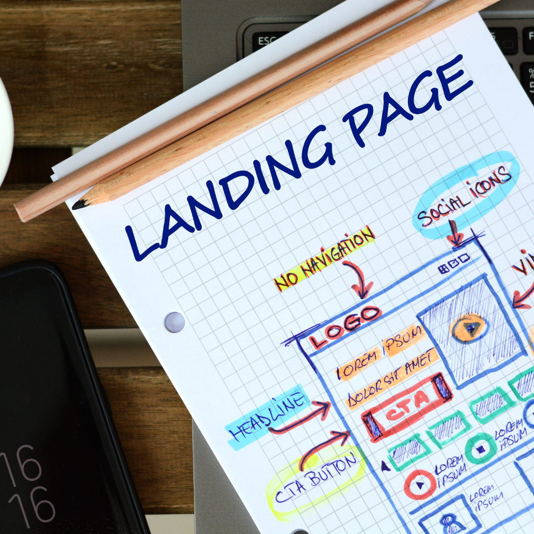
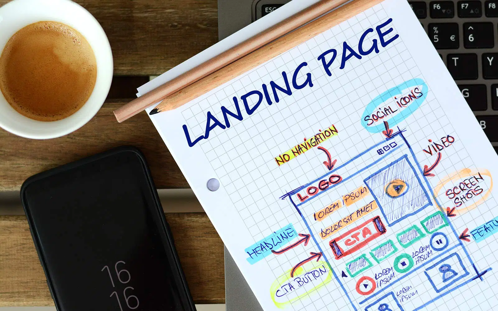
There are five key components that make up the structure of a conversion-focused landing page:
- Headline - clearly and concisely address the offer
- Copy - text that should explain the value of the offer clearly and in a compelling way
- Image - gives visitors a tangible idea of what they’ll receive
- Form - where visitors submit their information in exchange for the offer, converting them into leads
- CTA - button that visitors click to take the desired action on your landing page.
Besides the 5 components that can’t be missed when creating a landing page, there are a few best practices that should be implemented to guarantee a landing page’s success. We’ll dive deeper into each one of these:
Focus on a benefit-focused headline
The bouncing off rate of a landing page is estimated to be around 7/10. To try to reduce this number, the visitors need to know what’s in it for them within the first few seconds. The headline is the first thing they read and see, hence why it should clearly and concisely address the offer and the value of your landing page.
Pick an image that illustrates the offer
Having an image is a mandatory aspect and it should represent your target audience. Having an image is a mandatory aspect and should represent your target audience. Imaging can be a good asset to transfer the feeling of your visitor once they receive your offer.
Write a coercive copy
The copy is the key element to guide your visitor to the action you want them to fulfill. Accordingly, it has to be clear, concise and compelling. Use words directed to the user to make them feel engaged, such as “you” or “your”.
Include the lead form above the fold
The term “above the fold” refers to the upper half of a front page, meaning that it is placed at first sight to avoid visitors having to scroll looking for a form.
It is important to have a balance between having too much or too little above the fold. You should have your headline, sales proposition and CTA at first sight, but be aware of placing too much information in the first half, as it may make it difficult to access the CTA.
Pro tip: Create a scrolling with the user as they move down the page.
Add a standout call-to-action
The call-to-action (CTA) is probably the most important element on your landing page, as it boosts conversion. The CTA button must stand out. Here are tips so your CTAs stand out.
- Use a color that contrasts relatively with other elements on the page.
- In order to focus your visitor’s attention on the CTA only, it is recommended that you remove any other links on your page that may distract your visitors.
- Write in the I-form: A CTA in the I-form is often more powerful. For example "Download the e-book" is more powerful than "You can download the e-book here"
- Be specific: a button with "Download here" is quite unclear. Make it specific by adding the subject, for example "Download the eBook here".
- Make it attractive: to make it extra attractive you can add words such as 'fast', 'free', 'cheap' etc. For example "Download the free e-book here".

Give away a relevant offer
An offer is the value you give in exchange for your lead’s personal information. Besides being relevant for your business, this offer needs to encourage your visitor to provide their contact info in the first place.
Only ask for what you need
It is important to gather as much information as possible about your lead without being too invasive. Usually, a name, an email and a mobile number are more than enough to nurture a new lead. The less you ask for, the lower the barrier of entry.
Make your page responsive
The landing pages need to be responsive to accommodate every visitor’s viewing experience. Especially with the increase of mobile devices’ use, it is crucial that you provide your visitors every opportunity to convert, no matter from where and how they are viewing your page.
Optimize you visitor’s search experience
Benefit from target keywords for your paid campaigns and organic search. Your landing page should pop-up when a visitor searches for your keyword or phrase.
Thank your visitors for their time
A thank you page could bring you many benefits. It gives your visitor the confirmation that you gave them what you promised and a sense of caring and appreciation for filling out the form. It also gives them the opportunity to focus on other relevant content you might offer.
There is also the option of sending a follow-up email as a thank you. After your prospect completes the form fill-in, they get a thank you email as a way of keeping in touch with you.
Share this
You may also like

5 reasons why you need a landing page!

What not to forget when creating a landing page

