The way to an accessible website: Page settings
When putting a page online, it is important to take a good look at the settings. You may quickly think that you have to be very technical to get these settings right, but don't worry here you can read in simple language how you can take that extra step!
A number of settings in your page can make all the difference for an accessible website. It is often a small effort but has a major impact for people living with a (visual) disability. This blog is based on WCAG 2.1 level A and some points level AA.
Website structure
The criterion 1.3.1 Info and Relationships refers to the relationships between elements on your website. It is important that you use headlines, as discussed earlier in the road to an accessible website: texts.
Furthermore, it is wise to use tables and lists for a clear layout. Avoid blank lines without content as much as possible.
Website language
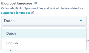
Always enter the language in which your website is written. If you do not fill this in or do so incorrectly, screen readers may read the text incorrectly. You can easily enter this via HubSpot under the settings heading.

Do you use multiple languages? Indicate that too, this involves a little bit of code, but is easy to adjust. In the top right corner of your rich text field, go to Advanced > Source code . Add lang="en" to a <p> tag here, "en" here stands for english. View the list of all country codes here.
Example: <p>hello in Spanish is: <span lang="es">Hola!</span>.</p>
Clear navigation
Website elements such as headers and footers often contain navigation elements that appear on every page. Make sure that the navigation returns on every page in the same way, so in the same order and with the same names. HubSpot already helps with this, they have a menu tool where you can easily reuse menus.
Avoid navigations that are too long or complex. Often this can be overwhelming and may result in a point of drop out.
Mobile Friendly
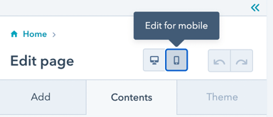
Nowadays, a mobile-friendly website is indispensable! I bring this to light, because it is also important for accessibility. Many HubSpot themes are already mobile-friendly and take this into account. Test your website with Google's mobile friendliness test. Via HubSpot you can see a preview and edit a few things next to "edit page".

A responsive website is important not only for mobile users, but also for people who zoom in on your website. It can be annoying for them if content overlaps or shifts.
Skip to left
Website pages often contain repeating content such as a header. Create a link for these elements so that you can skip them. Unfortunately, content editors can't do this themselves yet, but I'm happy to help you. Contact us for more information.
If you can install it yourself, pay attention to the following points below:
- The links will appear when you start tabbing through your website.
- They are often placed in the top left before the header.
- Header is called skip to content/main.
- Sidebar is called skip to sidebar.
- Search bar is called skip to search.
- Footer is called skip to footer.
Page title
Make sure your page titles are easy to understand enabling people to easily navigate through your website. You are free to decide how, but a tip is, put the most important subject first followed by the company name.
In many different ways
This criteria may seem obvious, but you should always ensure that website visitors can reach your content in different ways. Think of a header and footer with navigation. For additional options, you can add a search function or sitemap to your website.
Want to know more about accessibility? See the collection page of our blogs here . Curious about what we can do for you? Don't hesitate to contact us .
Share this
You may also like

Make your website accessible? This is how you do it!

What are the additional benefits of an accessible website?


