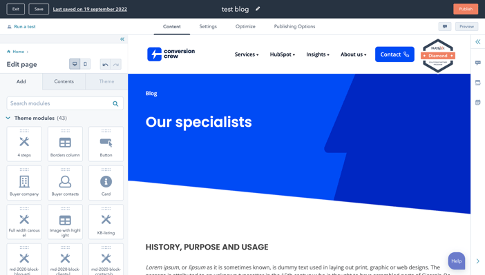
A landing page allows you to navigate visitors to your website. It increases the chances of converting prospects into customers by promoting your brand. Because bringing in visitors is so important, there are aspects you should not forget when creating a landing page.
HubSpot allows you to easily create landing page templates with the drag and drop feature. These templates can be very useful and time-saving. You can choose to create your own template or use HubSpot's standard templates. Nevertheless, if you want to know about the best practices for landing page templates, be sure to click here.

Landing page structure
The good news is that you don't have to be creative to create a landing page. However, it is important that, when creating your landing page, you look at the following elements:
Header
A header is meant to name a section of a page. The header is scanned by the search engine to understand what content the landing page offers. Because of this, it is important that your header is as attractive as possible, otherwise visitors will not visit the page.
Image
This module is specifically targeted for images. You can choose an image that is already part of the files within HubSpot or upload a new image from your computer.The image on your landing page is one of the first things people see when they visit this page. Because of this, an image sets the tone for their entire experience on your landing page. It can be difficult to select a good image, which is why you can ask yourself the following questions to make the best choice:
- Who is my target audience?
- Where on my landing page should the visitors look?
- Does this image convey what I want to say on my landing page?
Form
This module allows you to choose any form that is relevant to the landing page. This form must first be created in the forms tab before it can be used on a landing page.
The placement of a form on a landing page is also very important. For the highest conversion rate, it is recommended to place the form above the fold. Also, make sure the form attracts attention by purely focusing on the form.
Call-To-Action
What cannot be missing from a landing page is a call-to-action button. With this module, you can add a CTA or any other type of button to the landing page. You can also customize the color, text and style of this button to your liking.
When it comes to designing a CTA, there are a few tips to make it as attractive as possible so that visitors feel compelled to click on it.
- Give your CTA a vibrant and contrasting color to stand out.
- Focus the text of your CTA on the benefit to the visitor.
- Use action verbs such as: download, click, get, fill.
- Make the button big enough so that it stands out on the page.
- Give the button some space so it doesn't get lost in the text.
- Test the shape and text of your button for best results.
Rich Text
This module supports different types of content such as text, links, tables, embed code and images.
Maybe it comes as a surprise but most website visitors do not read every word of a text. Instead, they scroll through the page and pick out only the important words from the text. It's important to make those very pieces of text stand out so your visitor doesn't miss important information. You can do that by:
- Putting the most important information above the fold. This way the visitor does not have to scroll to get to the information.
- Use white space around the text to keep the visitor engaged and focused on the text you are trying to convey.
- Write with bullet points and short paragraphs to make the text readable.
Video
This module works the same as the image module. And is also just as important as an image because video marketing is becoming increasingly popular. The key to a good video is to create one that does not distract visitors from the ultimate goal: the CTA or form.
Why do videos work on a landing page?
- It increases conversion;
- Considered a more personal way to share a message and connect with prospects.
- Can be more interesting than an image.
- A video is viewed faster than reading text.
Settings
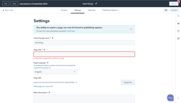
After the landing page has gained shape and content, it's time for the next step: settings.
Landing page settings ask you to enter an internal name and the title of the page. In addition, you can also choose the language in which the landing page should be displayed. You can also find the URL, campaign the page is associated with and the main image in the settings tab.

Optimizing the landing page
In addition to settings, you also have the option to optimize the page as best you can. Here you can think about linking a topic or subtopic keyword or the SEO recommendations to optimize your landing page for the search engine.
Another important aspect of optimizing the landing page is how the page looks for different devices. You have the option of viewing the page from the perspective of a computer, tablet or a phone. Here it is important to make sure that the landing page is as accessible as possible for the different devices. Want to know how to make a page as accessible as possible? Find out more on our accessibility blogs.
Also important to know is that more than half of website traffic comes from mobile devices. Therefore, it is important that the user experience is the same on every device. By optimizing the landing page and making it responsive, visitors on any device can easily view the page and convert. This way, you won't lose any visitors.
Share this
You may also like

3 things to focus on when upgrading to HubSpot Enterprise Hub

Get started with Hubspot CMS: unleash your website's potential

